What is CSS BEM?
The BEM methodology is a naming convention for CSS classes in order to keep CSS more maintainable by defining namespaces to solve scoping issues. BEM stands for Block Element Modifier which is an explanation for its structure. A Block is a standalone component that is reusable across projects and acts as a “namespace” for sub components (Elements). Modifiers are used as flags when a Block or Element is in a certain state or is different in structure or style.
/* block component */
.block {
}

/* element */
.block__element {
}

/* modifier */
.block__element--modifier {
}
Here is an example with the class names on markup:
<nav class="navbar">
  <a href="/" class="navbar__link navbar__link--active"></a>
  <a href="/" class="navbar__link"></a>
  <a href="/" class="navbar__link"></a>
</nav>
In this case, navbar is the Block, navbar__link is an Element that makes no
sense outside of the navbar component, and navbar__link--active is a
Modifier that indicates a different state for the navbar__link Element.
Since Modifiers are verbose, many opt to use is-* flags instead as modifiers.
<a href="/" class="navbar__link is-active"></a>These must be chained to the Element and never alone however, or there will be scope issues.
.navbar__link.is-active {
}- Alternative solutions to scope issues like CSS-in-JS
What are the advantages of using CSS preprocessors?
CSS preprocessors add useful functionality that native CSS does not have, and
generally make CSS neater and more maintainable by enabling DRY (Don’t Repeat
Yourself) principles. Their terse syntax for nested selectors cuts down on
repeated code. They provide variables for consistent theming (however, CSS
variables have largely replaced this functionality) and additional tools like
color functions (lighten, darken, transparentize, etc), mixins, and loops
that make CSS more like a real programming language and gives the developer more
power to generate complex CSS.
- They allow us to write more maintainable and scalable CSS
- Some disadvantages of using CSS preprocessors (setup, re-compilation time can be slow etc.)
Using flexbox, create a 3-column layout where each column takes up a col-{n} / 12 ratio of the container.
<div class="row">
  <div class="col-2"></div>
  <div class="col-7"></div>
  <div class="col-3"></div>
</div>
Set the .row parent to display: flex; and use the flex shorthand property
to give the column classes a flex-grow value that corresponds to its ratio
value.
.row {
  display: flex;
}

.col-2 {
  flex: 2;
}

.col-7 {
  flex: 7;
}

.col-3 {
  flex: 3;
}
Can you name the four types of @media properties?
all, which applies to all media type devicesprint, which only applies to printersscreen, which only applies to screens (desktops, tablets, mobile etc.)speech, which only applies to screenreaders
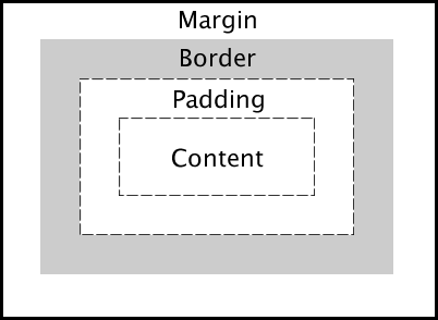
Describe the layout of the CSS Box Model and briefly describe each component.
Content: The inner-most part of the box filled with content, such as text, an
image, or video player. It has the dimensions content-box width and
content-box height.
Padding: The transparent area surrounding the content. It has dimensions
padding-box width and padding-box height.
Border: The area surrounding the padding (if any) and content. It has
dimensions border-box width and border-box height.
Margin: The transparent outer-most layer that surrounds the border. It
separates the element from other elements in the DOM. It has dimensions
margin-box width and margin-box height.
What is the difference between em and rem units?
Both em and rem units are based on the font-size CSS property. The only
difference is where they inherit their values from.
emunits inherit their value from thefont-sizeof the parent elementremunits inherit their value from thefont-sizeof the root element (html)
In most browsers, the font-size of the root element is set to 16px by
default.
What are the advantages of using CSS sprites and how are they utilized?
CSS sprites combine multiple images into one image, limiting the number of HTTP requests a browser has to make, thus improving load times. Even under the new HTTP/2 protocol, this remains true.
Under HTTP/1.1, at most one request is allowed per TCP connection. With HTTP/1.1, modern browsers open multiple parallel connections (between 2 to 8) but it is limited. With HTTP/2, all requests between the browser and the server are multiplexed on a single TCP connection. This means the cost of opening and closing multiple connections is mitigated, resulting in a better usage of the TCP connection and limits the impact of latency between the client and server. It could then become possible to load tens of images in parallel on the same TCP connection.
However, according to benchmark results, although HTTP/2 offers 50% improvement over HTTP/1.1, in most cases the sprite set is still faster to load than individual images.
To utilize a spritesheet in CSS, one would use certain properties, such as
background-image, background-position and background-size to ultimately
alter the background of an element.
What is the difference between ’+’ and ’~’ sibling selectors?.
The General Sibling Selector ~ selects all elements that are siblings of a
specified element.
The following example selects all <p> elements that are siblings of <div>
elements:
div ~ p {
  background-color: blue;
}
The Adjacent Sibling Selector + selects all elements that are the adjacent
siblings of a specified element.
The following example will select all <p> elements that are placed immediately
after <div> elements:
div + p {
  background-color: red;
}
Can you describe how CSS specificity works?
Assuming the browser has already determined the set of rules for an element, each rule is assigned a matrix of values, which correspond to the following from highest to lowest specificity:
- Inline rules (binary - 1 or 0)
- Number of id selectors
- Number of class, pseudo-class and attribute selectors
- Number of tags and pseudo-element selectors
When two selectors are compared, the comparison is made on a per-column basis (e.g. an id selector will always be higher than any amount of class selectors, as ids have higher specificity than classes). In cases of equal specificity between multiple rules, the rules that comes last in the page’s style sheet is deemed more specific and therefore applied to the element.
What is a focus ring? What is the correct solution to handle them?
A focus ring is a visible outline given to focusable elements such as buttons and anchor tags. It varies depending on the vendor, but generally it appears as a blue outline around the element to indicate it is currently focused.
In the past, many people specified outline: 0; on the element to remove the
focus ring. However, this causes accessibility issues for keyboard users because
the focus state may not be clear. When not specified though, it causes an
unappealing blue ring to appear around an element.
In recent times, frameworks like Bootstrap have opted to use a more appealing
box-shadow outline to replace the default focus ring. However, this is still
not ideal for mouse users.
The best solution is an upcoming pseudo-selector :focus-visible which can be
polyfilled today with JavaScript. It will only show a focus ring if the user is
using a keyboard and leave it hidden for mouse users. This keeps both aesthetics
for mouse use and accessibility for keyboard use.